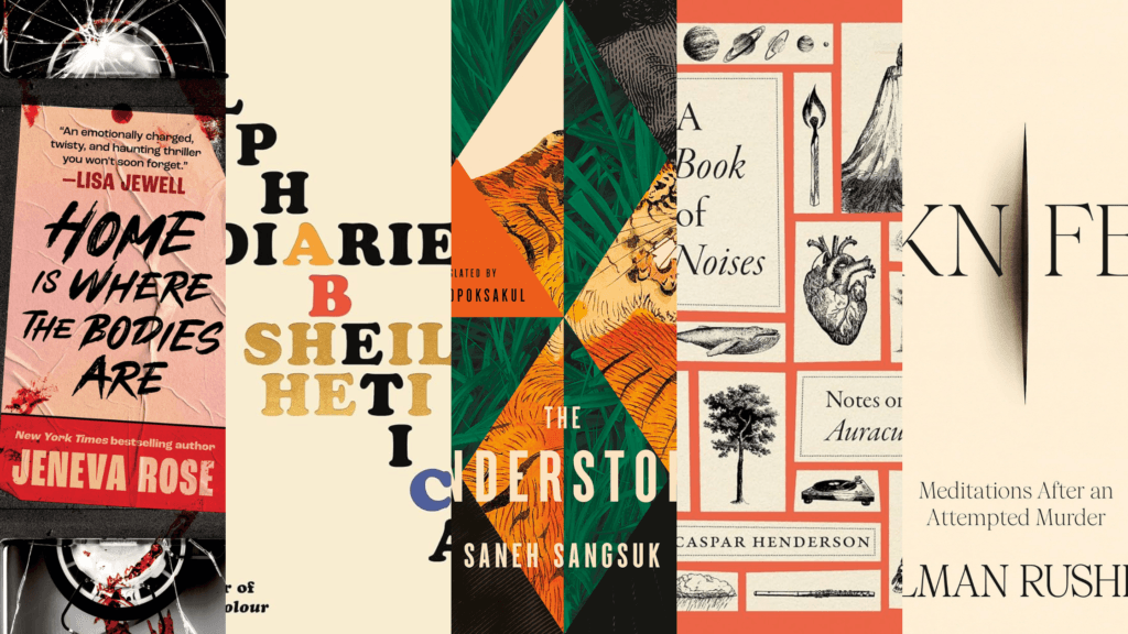
Library rule number one: never judge a book by its cover. Except that’s exactly what I’m going to do. I know. I know. Shame. Shame. Last year around this time I talked about my favorite album covers and how the cover art can draw you in and give you a visual taste of what the music might hold for your ears. This time I’m going to be taking a look at some of our newer books with covers that I find interesting, eye-catching or just beautiful. In my defense, I will only be judging the book covers, not the books themselves. See? I’m not totally breaking the rules.
Anyway, let’s dive into it.
First up is Alphabetical Diaries by Sheila Heti.
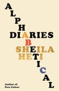
I’m going to be honest with you. I’m a huge wordplay nerd so this cover art really strikes my fancy. The design by Na Kim features the cascading word “alphabetical” not only highlights the author in shiny gold lettering, the content, and the basis of the book in a pleasantly minimalist fashion, it playfully includes an ABC joke with a small pop of color to brighten the otherwise basic composition. It’s simple, concise and cute. The book is a diary spanning over an entire decade and then trimmed down and arranged alphabetically instead of chronologically. It’s such an interesting and complicated concept for a diary juxtaposed by the simplicity of the book cover. I love it. So much so that I picked this up for myself to read from the cover alone, adding it to my neverending To-Read pile.
Home is Where the Bodies Are by Jeneva Rose

What a title! Am I right? And would you look at this cover art… There’s something suspenseful about a battered bloody broken VHS. I can already tell this book is going to be fun, dark and perhaps a little nostalgic. The title of the book is also presented as if it were the title of the VHS tape which I think is a fun play on imagery as well as the size of the book itself being comparable to the dimensions of a VHS. How fun! This design by Sarah Reidlinger really hones in on a major part of the story: a seemingly mundane tape but without actually reading the book, you’re left wondering what’s so special or sinister about it? Is IT the murder weapon?! Guess you’ll have to find out when you check it out for yourself.
The Understory by Saneh Sangsuk

I just think this one is pretty. I don’t have one major reason that I was drawn to this cover by Emily Mahon. I simply love the colors and the shapes and the way three things are meshed together through a geometric fracturing of the images. The lush green and bright vibrant orange are in stark contrast with black and white. We have a blending of man, beast, and the jungle itself which, if I had to guess, the story might lean into the idea that these three are separate yet enmeshed entities. Or perhaps the pieces that make up the full mosaic. Or perhaps the truth is a bit of both. I’ll tell you right now I’ve read the synopsis after much speculation about the book cover and I’m WAY off…or maybe not entirely. Intrigued? I thought so. One interesting detail is that this isn’t the only book cover. Another cover version by Miki Lowe that features only the tiger and the jungle… now I bet I’ve really piqued your interest.
Knife: Meditations After an Attempted Murder by Salman Rushdie

I know. I know. ANOTHER minimalist one. But c’mon! Look at it! It’s so engaging. At first glance, you think something actually happened to the book cover, and then surprise! The title is called Knife. It looks as if the book were split open at the seams or even surgically split right to the chest. It also feels very poignant that the word “knife” is cut in two. The book is about the author surviving an attempt on his life, giving Knife its obvious symbolism. However, I would argue there’s another metaphor around how words themselves can leave a wound which might be why the title itself is cut in two… And here’s the other thing: The second most eye-catching words on the cover are the author’s name and frankly that alone will draw me in. Salman Rushdie is an excellent author and I don’t think it’s a coincidence in Arsh Raziuddin’s design. For those of you questioning why such a wonderful author like Salman Rushdie had an attempt made on his life… this is just the book for you.
The Book of Noises: Notes on the Auraculous by Caspar Henderson
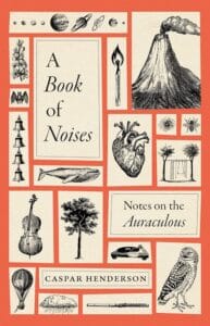
Now, I am somewhat cheating on this one. Its publication date was late at the end of LAST year so it technically doesn’t fit into my this-year’s book covers. That being said, the cover is precisely why I chose to read it. Let’s break it down, shall we? Rae Ganci Hammers’s design is fairly simplistic with the images arranged the way you might pin butterflies in a shadow box, but the contents are far from similar. At first glance, all these images seem unrelated. There’s a mix and match of the mundane as well as the cosmic. What does a volcano have to do with a whale or a tree? Is that… the entire solar system up top left? What in the world does that have to do with sound? Have any guesses? It’s not fair to ask me; I’ve already read and loved the book. Don’t you think it’s important to note that the heart is placed centrally in this design? I don’t know about you, but I HAD to know what all of these images meant for the world of sound, and that to me is the mark of a good book cover.
Have you read any of these? Have you ever chosen a book solely from its cover? Either way, I hope you enjoyed my top five book covers for this last year (sorta). Happy winter. Stay cozy!

About The Author: Rebecca
More posts by Rebecca