“Music is art to the ear and art is music to the eye-” Tayna Frid
It’s that time again. Actually this time it’s a little different. This time I’m going to be talking about the cover art for music. Album covers set the mood of the album to come. Now you’re not supposed to judge a book by its cover, but I absolutely believe in judging an album by its cover art. Many musical artists slave over what to put on the front of their albums. It’s by no means an easy process
How do bands choose their album art anyway? Often times they collaborate with an artist, but sometimes they design them themselves or hold contests. Album art represents the artist, their music and the album as a whole. The album art is very much like the cover of a book. It needs to be eye-catching to the musician’s audience while at the same time representative of the band. If it sounds like a challenge, it most certainly is.
This is precisely why I have the difficult task of choosing my top album covers for 2023. To limit the possibilities to a manageable amount, I’ll only be including albums from within the Salina Public Library Catalog. I’ll be choosing one album art from several genres and keep in mind this is just my personal preference for what I think makes a good album cover.
Now! Onto the list of album art that I think is awesome, is memorable, represents the music well or just looks cool (in no particular order).

Country
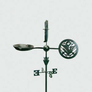
Weathervanes / Jason Isbell and the 400 Unit
This is Jason Isbell’s 9th album. At a glance, the album cover looks very simple, but there are a lot of little symbols in this black and white photo of a weathervane. For instance, why does it only have East and South? What does the broken knife on top symbolize? Is that a frying pan on the right? (truth be told it’s a reference to one of the songs “Cast Iron Skillet.”) At first glance, I knew this album was probably full of symbolism and that’s just from the art adorning the cover.

Pop
Broken by desire to be heavenly sent / Lewis Capaldi
To truly appreciate this cover art, one needs to look at this artist’s last album cover. His debut album was released in 2019 and featured a figure seated on the ground in contemplative thought surrounded by red and was titled “Divinely Uninspired to a Hellish Extent.” While this album seems to be more peaceful on the surface, the figure still has the same listlessness about him, staring off in thought only this time surrounded by what looks to be an endless staircase and the openness of the sky. Is he ascending upward after his last album? Or is he descending again after having reached as far as he can go? Paired with the title of the album, it could go both ways which is why I find this cover art particularly captivating.

Rap
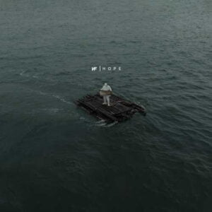
Hope / NF
This is hardly an image that conjures hope as the album title implies. This is precisely why I’m in love with it. The figure is adrift on a slate-gray sea with nothing but a raft, no land in sight and it looks like he’s even holding a useless map. This listless drifting seems pretty hopeless, but the figure is wearing white. This artist is known for being clad in black for his previous projects, so for fans this attire is a big deal and a heavy dose of symbolism. Even before listening, I can tell this artist is baring his emotions…and they’re going to be heavy ones.

Rock
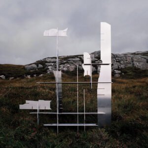
Less / Deathcrash
What’s interesting about this image is the story that goes along with it. This metal sculpture accompanied the band to the north coast of Scotland where they recorded in the UK’s “most remote studio.” The sculpture was later burned for the filming of the “Empty Heavy” music video which is the first track on the album after the prelude. The sculpture itself is said to parallel the band’s vibe for this project. Less is more. Being mostly made of flat empty metallic space held together by intersections, the album title “Less” portrays a minimalist approach to music and often throughout the album, instruments move seemingly independently to each other and then eventually interweave. I don’t even have to fire this up to know it’s going to be an atmospheric album.

Metal
72 Seasons / Metallica
As a lover of metal music, this album jumped out immediately to me. Not just because it’s Metallica. Not just because it’s bright yellow. But because of how…clean it is. Metal albums are known for beautiful, meandering, sometimes-abstract-sometimes-grotesque artwork. This is a stark contrast to what I’m accustomed to think of when it comes to album art. Not only does the bright yellow contrast the blackened burnt possessions lying around the scene, it’s in contrast to what you would normally expect a metal cover to be. I’m a lover of details. Don’t most of these objects look like childhood toys to you? You’d be right. The album title 72 Seasons represents the first 18 years of life: the blackened crib, a prison to escape. A very metal depiction of a coming-of-age story.
I hope you enjoyed my top 5 album covers for 2023. As new albums are coming out every day, I’m sure there’ll be plenty more where these came from so hopefully I inspired you to come take a listen to some of these and see how they match up to their covers! Feel free to share your own favorites, or if we don’t have your favorite 2023 album in our catalog, suggest a title to us and see if we can get ahold of it. I’m always excited for new music. Happy jamming!

About The Author: Rebecca
Rebecca is a circulation clerk here at Salina Public Library. She has lived in Salina since shortly after she received her B.A from Bethany College in 2010. She graduated with a double major in English and a contract major in Philosophy of the 19th Century. She enjoys reading about trees, talking about plants, and nature walking on the trails around Salina. When she's not here you can find her thrifting, composting and tracking down a good coffee. She welcomes any garden pictures and can be reached at circ.rebecca@salinapublic.org.
More posts by Rebecca